The Sea in the Palette: A Brief History of Coastal Colour
Explore the history of coastal colour palettes and learn how to adapt familiar seaside hues to a room without losing sight of its light and materials.
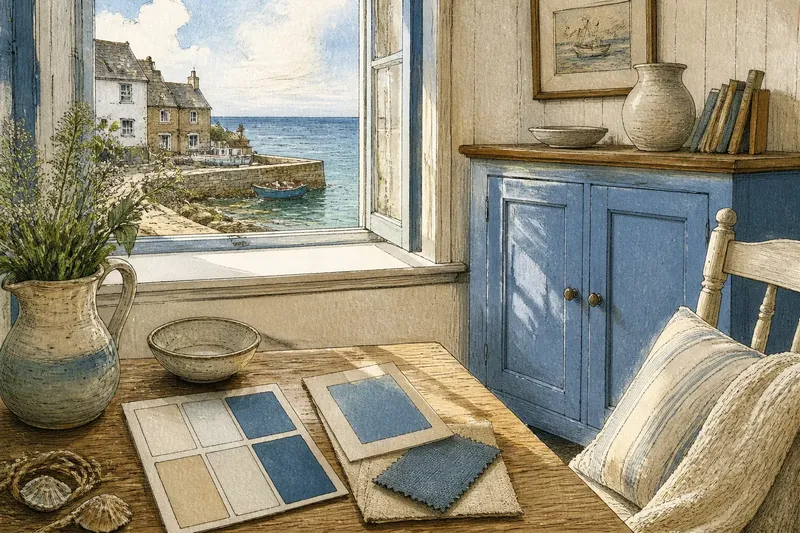
In a cottage kitchen, a blue cupboard can look grey before breakfast and vivid by afternoon. That shifting effect is part of the appeal of a coastal colour palette: the same paint meets changing light, nearby materials and the room’s own proportions. Its history is best read through those choices, rather than as a single style shared by every shore.
Light and local materials
Colour at the coast is rarely a stable reference. Water changes with cloud and depth; sand darkens when wet; pale stone can take on the colour of surrounding vegetation. A painted wall holds one version of colour in place, while daylight keeps altering how it appears.
Older buildings also carry evidence of their materials and maintenance. Limewash, timber, masonry and successive coats of paint each affect the colours that can be applied and how they age. The details differ from place to place, so it is safer to look closely at a particular building than to assume all coastal homes began with the same palette.
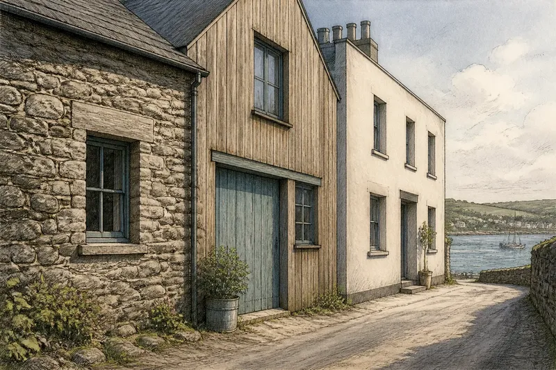
On a façade, compare the main wall with the door, shutters and trim. A muted wall with a stronger door creates a different balance from a house where every surface is pale. These contrasts can reflect successive alterations as well as a deliberate scheme.
Colour in daily use
Paint on a harbour building or boat may have been chosen for practical reasons, personal preference or both. A colour seen on working structures can later catch the eye of residents and visitors, but that does not make it a universal coastal tradition. Its meaning depends on the local setting and the particular object carrying it.
For a design decision, this distinction is useful. Rather than treating a hue as proof of a place’s history, ask what it does beside the materials already present. A strong blue on a door may sit comfortably against weathered timber; the same blue across a small room might dominate its furnishings and light.
It is not worth trying to reproduce every mark of age with distressed paint or a collection of themed objects. A considered contrast between wall, joinery and one or two furnishings often gives a clearer sense of character.
Holiday palettes
As seaside buildings were used for leisure as well as work, designers and visitors could carry colours associated with the coast into holiday accommodation and homes elsewhere. Those choices were interpretations, not exact records of local building practice. Blue and white became familiar shorthand in many settings because they readily evoke sky, water, sails and bright walls, but they are not the only colours found beside the sea.
Greens, reds, ochres and dark neutrals can also appear in coastal surroundings, on vegetation, boats, doors or landscape features. Their presence alone does not establish a specific historical meaning. The useful question is whether a colour belongs with the building’s materials and light, or is being used mainly to suggest a seaside mood.
Choosing a coastal palette
Begin with what is already fixed: floorboards, stone, brick, tiles and the direction of the windows. Then consider a wall colour, a joinery colour and a small accent. A paper paint chart or sample card can help compare undertones, but view it beside the actual surface and in both daylight and lamplight.
Say you are refreshing an invented guest room with cream walls, pine floorboards and a cupboard that looks too stark white. First, place a muted blue sample against the pine and observe whether it reads grey or green in the room’s light. Next, compare it with a softer cream sample for the cupboard. If the blue feels heavy, use the cream on the cupboard and reserve blue for a cushion; if it sits comfortably, use it on the cupboard and keep the cushion plain. The resulting decision is a palette scaled to the room, not a claim about how local houses were historically painted.
Questions about coastal colour?
Why are blue and white common?
They evoke familiar features such as water, sky, sails and pale walls. Their recognisable association with seaside settings is a design convention, not a rule for every coastal building.
Were coastal homes always pale?
No single palette applies to every coast or period. Existing finishes, available materials, maintenance and individual choices all shape a building’s colour.
How should I choose an accent colour?
Compare it with the room’s fixed materials and observe it under the light in which the room is used. If the accent overwhelms those surroundings, reduce its area or choose a quieter shade.
Can paint reveal a building’s past?
Colour and placement can offer clues, but a visible hue alone cannot establish when or why it was used. Where historical accuracy matters, consult a conservation professional or reliable local records.
Reading a specific place
A coastal colour palette works best when it responds to the building rather than relying on a stock set of seaside shades. Notice which surfaces are already prominent, how daylight changes them and where a stronger colour would have room to breathe. That approach keeps a design connected to its setting without pretending that one familiar combination represents every shore.