Stone, Timber or Render: Reading a Coastal Wall by Its Surface
Learn to read a coastal wall by its surface: distinguish stone, timber and render by texture, visual weight and the character they give a facade.
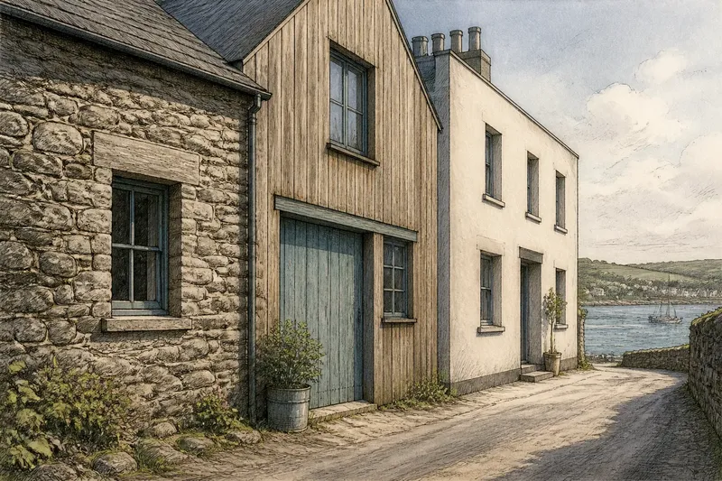
On a lane above the harbour, a rough stone wall catches the low light while a timber-clad house beside it seems to break into finer lines. Across the road, pale render holds the light as one calm plane. Reading a coastal wall by its surface means noticing these differences before deciding what the facade is saying.
Start with the surface
A facade is the outside face of a building, but its surface is not just decoration. The material, the way it is assembled and the detail of its finish shape how much visual weight the wall seems to carry. That impression can differ from the wall’s actual thickness or construction.
Look first from across the street, where the wall reads as a broad area of light and dark. Then move closer and notice joints, grain, tool marks and edges. The distant view reveals overall weight; the near view explains how that weight is made.
- Texture: Does the surface scatter light, reflect it evenly or break into repeated lines?
- Visual weight: Does the wall seem grounded and dense, or light and finely divided?
- Rhythm: Do joints and boards create a steady pattern, or does the surface vary from place to place?
- Edge: How does the material meet a window, corner, plinth or neighbouring wall?
These are descriptions, not judgements about quality. A smooth wall can feel substantial if its openings are deeply set; a textured one can seem delicate when its pieces are small and closely spaced.
Stone and visual weight
Stone usually reads as the most grounded of the three surfaces. Its pieces have visible edges, and their joints make the wall’s construction legible. A broad, irregular stone face can feel settled into its site, especially where the building meets a slope or a harbour-side lane.
Not all stone looks heavy in the same way. Large blocks with tight joints create a composed, almost continuous mass. Smaller rubble stone, with varied shapes and wider mortar lines, gives a more broken rhythm. The colour of the mortar matters too: a close match lets the stones dominate, while a strong contrast draws attention to the joints and makes the pattern more graphic.
At a coastal facade, look for changes in stone across the wall rather than assuming every elevation uses one consistent treatment. A rough lower portion can appear protective and anchored, while a smoother upper surface seems quieter. Whether that contrast is intentional or simply reflects the building’s construction is something to observe, not presume.
Stone’s texture can gather shadow in its joints and ledges. This gives the surface depth even when its colour is restrained. When describing it, terms such as “rugged”, “coursed”, “rubble-built” or “closely jointed” tell a reader more than “old-looking” or “traditional”.
Timber and fine rhythm
Timber changes the scale of a wall through boards, battens or shingles. Its repeated lines divide the facade into smaller parts, so a timber-clad building can appear lighter or more finely patterned than a solid masonry wall. The direction of those lines matters: vertical boards draw the eye upwards, while horizontal boards emphasise the length of the elevation.
Look at the spacing and depth of the joints. Narrow gaps and a flush finish make the cladding read as a fairly even skin. Overlapping boards or projecting battens create sharper shadows and a more pronounced rhythm. A close view may reveal grain and knots, but from the street those details often merge into the pattern of the boards.
Coastal weather affects timber’s appearance, though the result depends on the species, finish, exposure and maintenance. A painted surface may keep the boards visually unified; an exposed or weathered finish can make their grain and variation more apparent. Describe what is visible rather than treating a particular colour or patina as an inevitable sign of age.
Timber also makes transitions easy to notice. Where cladding stops at a corner or meets stone around a doorway, the change in texture becomes part of the facade’s composition. A neat edge can make the materials feel deliberately related; an abrupt one may make the wall seem assembled in separate pieces.
Render and quiet planes
Render is a coating applied over a wall to form its outer finish. Compared with exposed stone or board cladding, a smooth render surface can read as one broad plane, with fewer visible joints. It tends to make the shape of the building and the placement of openings more prominent than the texture of the wall itself.
“Smooth” is not the only useful description. Render may be fine-grained, brushed, floated or visibly uneven. At a distance, these differences can disappear into a single field; close up, they alter how light falls across the facade. A softly textured finish may catch small shadows, while a very even one can appear almost continuous.
Pay attention to corners and window reveals—the inner surfaces between a wall and its opening. Deep reveals create shadow and give a plain elevation a sense of thickness. Thin or sharply defined edges can make the same wall seem flatter and more graphic.
Render can also make small changes in plane easier to read. A projecting entrance or recessed bay may cast a clear shadow against an otherwise calm surface. This is one reason a pared-back wall can still feel carefully composed: its interest may come from form and edges rather than a busy material pattern.
Compare without guessing
Imagine walking along a lane where a stone cottage, a timber-clad workshop and a rendered house face the same open harbour. From the lane entrance, note which facade first appears as a solid mass, which breaks into parallel lines and which reads as a plain light shape. At the cottage, move closer to inspect the stone joints; at the workshop, follow the boards to the corners; at the house, look into the window reveals. The expected result is not a ranking but a more precise account of how each surface creates its character.
A useful description links a visible feature to its effect. “The wall feels heavy” is less informative than “large, closely jointed stones make the lower wall read as a continuous base”. Similarly, “the timber is cosy” says little about its facade; “vertical boards divide the elevation into narrow, repeated strips” gives the reader something they can picture and check.
Try writing one sentence from a distance and another from close range. The first might describe the wall’s overall weight or silhouette; the second can name the joints, grain or finish responsible. This keeps surface description grounded in observation instead of relying on broad labels such as “coastal” or “rustic”.
Questions about wall surfaces?
Which surface looks heaviest?
Stone often appears heaviest because its individual pieces and joints make the wall read as substantial construction. Large blocks, deep joints or a dark lower course can reinforce that impression, while smaller stones and fine mortar lines may soften it.
Does timber always look lighter?
No. Fine boards can make a facade feel delicate, but dark, closely spaced cladding may read as a dense surface. The board direction, joint depth and size of the elevation all affect the impression.
Can render have visible texture?
Yes. Render can be smooth, softly grainy or unevenly finished, and its appearance changes with the angle of light. Look closely at the surface rather than assuming the material forms a blank plane.
What should I mention first?
Start with what is clearest at a distance: the wall’s broad weight, pattern or plainness. Then name the visible feature—stone courses, board lines or a textured finish—that helps produce that effect.
Keep the description useful
For a field note, record the material, its texture and the way it meets the building’s openings or corners. A short phrase such as “rough stone below, smooth render above” captures a change that “mixed materials” misses. If you are unsure what a surface is made from, describe its visible qualities without naming it as a definite material.
It is not worth trying to infer a wall’s full construction from its outer face alone. A rendered wall may conceal several layers, and a timber-looking finish may be a different product altogether. Where identification matters for repair or specification, check the building information or ask a suitably qualified professional.
Reading a coastal wall by its surface is most useful when the description stays close to what the eye can verify: the size of the pattern, the depth of the shadows and the way the facade meets its setting. Stone can gather a building into a grounded mass, timber can articulate it in repeated lines, and render can let its shape speak more quietly. Notice which of those effects persists as you move from the lane to the wall itself.